- Patterns of Power (2) -
Table of Contents
1. Glyph Chromatics
2. Kaleidoscopic Patterns
1. Glyph Chromatics
I have made countless attempts to create colorful Glyphs that evoke the stained glass that I enjoy so much.
I've tried combining only primary colors. Combining only warm or only cold tones. I even tried colors with names that started with the same letter, like 'brown' and 'blue', hoping that I could unlock some sort of power through wordplay.
Unfortunately, every Glyph that I tried to compose in this manner failed to emit any sort of power.
Could it be that a change in color interferes with the shapes' ability to resonate with each other?
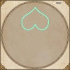
After much trial and error, I came to the conclusion that Glyphs must be drawn using only a single color.
2. Kaleidoscopic Patterns
It's easy to assume that Glyphs must necessarily be simple, since they are made from simple shapes. But a plethora of intricate patterns can be created by changing how these shapes relate to each other.
I'm particularly fond of creating new patterns by copying and rotating slices of the Glyph.
A rather impressive pattern can be produced by placing a single shape, then copying it 6 times while rotating it full circle.
After adding an outline and some additional flourishes, I was able to create a rather pleasing Glyph.